
Your portfolio is the one website where the design itself is the pitch, so building an animated portfolio website in Bricks is one of the best ways to stand out. An animated portfolio, where projects slide in with horizontal scroll, images reveal cleanly on scroll, and the hero heading animates in, turns your work into an experience and signals the quality you deliver.
The obstacle has always been that these effects, horizontal scroll, image reveals, text animation, rely on GSAP and usually require code. For a designer whose strength is visual craft rather than JavaScript, that’s a real barrier. The result is often a portfolio that undersells the person behind it. The good news is that no-code tools now make these exact effects buildable visually, so your portfolio can look as premium as your work.
This guide walks through building an animated portfolio website in Bricks, from starting with a portfolio template to adding the specific animations that make portfolios shine. You’ll learn which effects suit portfolio work, how to add them without code, and how to keep the site fast and usable.
To build an animated portfolio website in Bricks, start with a portfolio template that provides the main structure.
Add no-code animations that work well for portfolio websites, such as horizontal scrolling for project galleries, image reveals as projects enter the viewport, and split-text animation for the hero heading.
Tools like BricksFly combine portfolio templates with no-code GSAP effects, allowing you to build and animate the complete website visually.
Why Portfolios Need Animation
For most websites, animation is a nice enhancement. For a portfolio, it’s closer to essential, and understanding why shapes how you build one.

A portfolio’s job is to demonstrate quality and make your work memorable. A static grid of thumbnails does the first job weakly and the second barely at all, visitors scan and move on. Animation changes both. When projects reveal thoughtfully, when a gallery scrolls horizontally, when images scale in as you reach them, the work feels considered and premium. The presentation itself becomes evidence of your skill.
There’s also a memorability factor. Visitors, and especially potential clients or employers, see many portfolios. A static one blends in; an animated one that feels polished and intentional stands out and sticks in memory. For a designer or freelancer competing for work, being remembered is half the battle, and motion is a powerful way to be remembered for the right reasons.
Finally, an animated portfolio proves you can deliver animated sites, which is itself a selling point. If you offer web design services, a portfolio that demonstrates premium motion tells clients exactly what they can get. The medium becomes the message: your site shows, not just tells, what you’re capable of. That’s why investing animation effort into your own portfolio pays off more than almost anywhere else.
The Best Animations for Portfolio Websites
Not every effect suits a portfolio. These are the ones that work best for showcasing creative work, all buildable without code.
| Effect | Where to Use It | Why It Works for Portfolios |
| Split text (hero) | Main heading / intro | Premium first impression |
| Horizontal scroll | Project gallery | Distinctive, immersive showcase |
| Image reveal | Project thumbnails | Makes work feel intentional |
| Scroll reveal | Sections, case studies | Paces the story of your work |
| Parallax | Hero / feature images | Adds depth and richness |
| Hover animation | Project cards, buttons | Interactive, responsive feel |
Split Text on the Hero
Your portfolio’s opening line, “Designer & Art Director” or a short statement, is a perfect place for split text animation, where the heading reveals character by character or word by word. It sets a premium tone in the first second and frames the work that follows.
Horizontal Scroll for the Gallery
The signature portfolio effect: instead of scrolling vertically through projects, the gallery moves sideways as the visitor scrolls. It’s immersive and distinctive, turning a project list into an experience. It works especially well for showcasing a series of projects or a visual narrative.
Image Reveal for Project Thumbnails
As each project scrolls into view, the image reveals, fading, scaling, or masking in, rather than simply appearing. This small touch makes every piece feel deliberate and premium, elevating the whole gallery.
Scroll Reveal and Parallax
Scroll reveals pace the story of your work, bringing case-study sections and details in as the visitor reaches them. Subtle parallax on hero or feature images adds depth. Both keep the portfolio feeling alive without distracting from the work itself.
How to Build an Animated Portfolio in Bricks (Step by Step)
Here’s the practical workflow, from structure to animation. The goal is a premium animated portfolio without writing code.
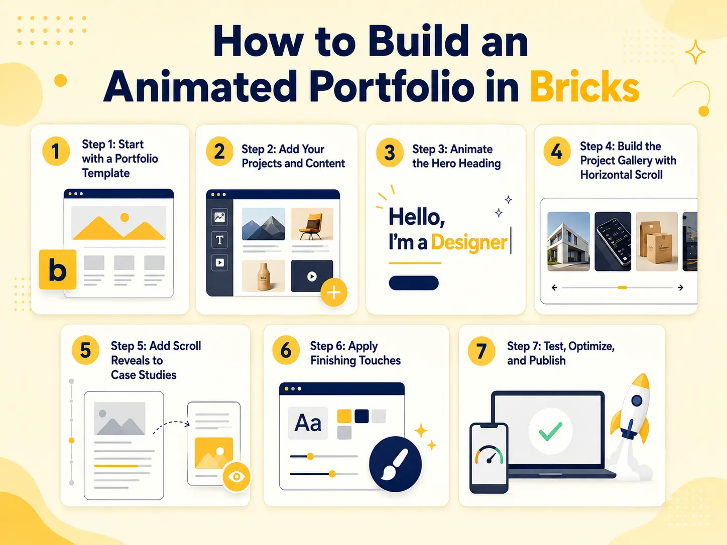
Step 1: Start with a Portfolio Template
Rather than building from a blank canvas, import a portfolio template that includes the pages you need, a home/work page, project or case-study pages, an about page, and contact. This establishes the structure and a professional design baseline in one step, so you focus on your work and your animation, not layout from scratch.
Step 2: Add Your Projects and Content
Replace the template’s placeholder projects with your actual work, high-quality (but optimized) images, project titles, and descriptions. Add your bio, services, and contact details. Get the content right before animating, so you’re animating the real thing.
Step 3: Animate the Hero Heading
Apply split-text animation to your main heading so it reveals as the page loads. Keep it quick and subtle, this is the first impression, so it should feel premium, not slow. This is your portfolio’s opening statement.
Step 4: Build the Project Gallery with Horizontal Scroll
Turn your main project showcase into a horizontal-scroll section, so work slides sideways as visitors scroll. This is the portfolio’s centerpiece effect. Pair it with image reveals so each project appears cleanly as it enters view.
Step 5: Add Scroll Reveals to Case Studies
For individual project or case-study sections, add scroll reveals so content and images animate in as the visitor scrolls through. This paces the story of each project and keeps the deeper pages engaging.
Step 6: Apply Finishing Touches
Add subtle parallax to a hero or feature image for depth, and hover animations to project cards and buttons for an interactive feel. Keep these light, they’re accents, not the main event.
Step 7: Test, Optimize, and Publish
Preview the live site and scroll through as a visitor would. Test on mobile, horizontal scroll especially needs a mobile check, and confirm images are optimized so the site stays fast. Respect reduced-motion settings, replace any remaining placeholders, then publish.
That’s a complete animated portfolio, built visually from a template plus no-code effects.
Examples and Use Cases
Here’s how animated portfolios come together for different creatives.
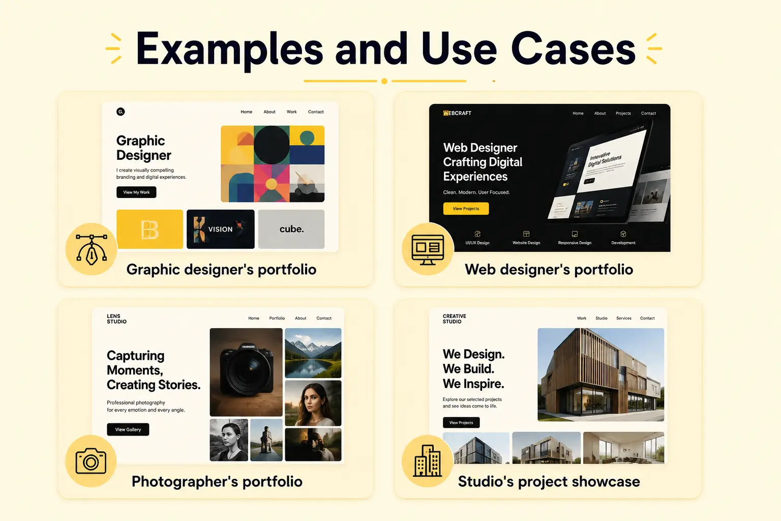
A graphic designer’s portfolio. A split-text hero introduces them, a horizontal-scroll gallery showcases branding projects, and image reveals make each piece feel intentional. The site itself demonstrates their eye for design.
A web designer / freelancer’s portfolio. Beyond showing work, the animated site proves freelancer’s can build premium animated experiences, doubling as a live sample of the service they sell. Scroll reveals pace their case studies to tell the story of each project.
A photographer’s portfolio. Image reveals and subtle parallax let the photography take center stage, with animation enhancing rather than competing with the images. Horizontal scroll presents a series as a visual narrative.
A studio’s project showcase. A horizontal-scroll section walks visitors through flagship projects, while pinned or scroll-revealed case studies go deeper for interested clients.
In each case, the animation is chosen to serve the work, making it feel premium and memorable, rather than decorating for its own sake.
Common Mistakes to Avoid
Animated portfolios are easy to overdo. Watch for these.
Animation overshadowing the work. The point is your work, not the effects. Keep animation supporting the projects, never competing with them.
Over-animating. Too many effects make a portfolio feel busy and slow. Choose a few signature effects (hero split text, horizontal gallery, image reveals) and keep the rest subtle.
Unoptimized images. Portfolios are image-heavy, so large, uncompressed images are the biggest performance risk. Optimize every image before publishing.
Horizontal scroll that breaks on mobile. This effect needs care on phones. Test it and simplify or switch to a vertical layout on mobile if needed.
Slow animations. Long durations make the site feel sluggish and delay the work. Keep effects quick.
Ignoring reduced motion. Respect the reduced-motion setting so the portfolio stays usable for everyone.
Leaving placeholder projects. Replace all template placeholders, nothing undercuts a portfolio like demo content left in.
How BricksFly Helps
Building an animated portfolio in Bricks is far easier when your templates and animation come from one tool. BricksFly is a complete Bricks Builder toolkit that includes portfolio-suitable full website templates plus the no-code GSAP animation effects portfolios need, so you can build the whole site visually.
Start with a portfolio template, complete with the pages a portfolio needs, then add your work. From there, BricksFly’s no-code animation lets you apply the exact effects that make portfolios shine: split text on the hero, horizontal scroll for the project gallery, image reveals on your thumbnails, scroll reveals for case studies, and subtle parallax, all through visual controls, no JavaScript required. Because these are the effects portfolios rely on, you’re not fighting the tool to achieve a premium look.
The added benefit is that everything lives in one toolkit. 30+ Full Website Templates, 500+ sections (for any custom pages, like a detailed case study), extra Elements, and animation all come together, so building and animating your portfolio happens in one workflow. For designers and freelancers, that means a portfolio that looks as premium as your work, and doubles as proof you can deliver animated sites, without needing to code.
Conclusion
An animated portfolio website in Bricks is one of the highest-payoff projects a designer or freelancer can build, because the site itself becomes proof of your skill. The effects that make portfolios shine, split text on the hero, horizontal scroll for the gallery, image reveals, and scroll-paced case studies, used to require code, but no-code tools now make them buildable visually.
The approach is straightforward: start with a portfolio template for structure, add your real work, then layer on a few well-chosen animations that serve the work rather than overshadow it. Keep images optimized, effects subtle and quick, and test on mobile, and you’ll have a portfolio that looks as premium as the work it presents.
FAQs
Start with a portfolio template for the structure and design baseline, then add your projects and content. Apply no-code animations that suit portfolios: split text on the hero, horizontal scroll for the gallery, image reveals on thumbnails, and scroll reveals for case studies. Tools like BricksFly provide portfolio templates and these effects together, so you build it all visually.
The best portfolio animations are split text on the hero heading (premium first impression), horizontal scroll for the project gallery (distinctive showcase), image reveals on thumbnails (makes work feel intentional), scroll reveals for case studies (paces the story), and subtle parallax for depth. These enhance the work rather than distract from it.
Yes. No-code animation tools like BricksFly let you turn a project gallery into a horizontal-scroll section through visual controls, no JavaScript needed. You enable the effect on the section and tune it visually. Just test horizontal scroll on mobile, since it behaves differently on small screens and may need simplifying there.
It can if overused or paired with unoptimized images, and portfolios are image-heavy, so images are usually the bigger risk. Optimize every image, keep effects purposeful and quick, and test on mobile. GSAP itself is efficient, so a few well-chosen effects on an optimized site have minimal performance impact.
You can build from scratch, but a portfolio template saves significant time and gives you a professional design baseline, including the pages a portfolio needs (work, project, about, contact). Starting from a template lets you focus on adding your work and animation rather than building structure. BricksFly includes portfolio-suitable templates for this.
Generally subtle, with one or two signature moments. The work should be the star, so most effects (scroll reveals, image reveals, parallax) should be understated. You can be a little bolder with a signature effect like horizontal scroll or a split-text hero, since those define the experience. Avoid animating everything, restraint reads as premium.