

Scroll animations can make a Bricks website feel more polished and interactive, but only when they help visitors follow the page.
A heading reveal can guide attention to an important message. A pinned section can explain a product step by step. A subtle image effect can make a portfolio feel more engaging.
The goal is not to animate everything.
Good scroll animation helps visitors notice the right content at the right time without making the page harder to read, navigate, or use.
Quick Answer
Use scroll animations in Bricks to draw attention to important sections such as hero content, feature sections, product walkthroughs, portfolios, case studies, and CTAs. Keep the effects simple and use them only when they support the content. For more advanced interactions, you can use effects such as ScrollTrigger, Sticky/Pin, parallax, Split Text, image reveals, and horizontal scrolling. Always keep the content easy to read and test more complex animations carefully on mobile.
Key Takeaways
- Use scroll animations only where they help visitors notice or understand important content.
- Hero sections, feature blocks, product walkthroughs, portfolios, case studies, and CTAs are good places to use scroll effects.
- Simple reveals and stagger animations work well for most sections, while advanced effects are better for more interactive layouts.
- Use effects such as ScrollTrigger, Sticky/Pin, parallax, Split Text, image reveals, and horizontal scrolling when they support the content.
- Avoid animating every element, using overly slow effects, or adding motion that makes content harder to read.
- Always test scroll animations on mobile and make sure the page remains usable with reduced motion.
Where Scroll Animations Can Improve Engagement
Not every section needs motion.
Scroll animations work best when it gives extra attention to content that matters.
Hero Sections
The hero is usually the first place visitors decide whether to keep exploring.
A simple animation can help establish the visual order of the section.
For example, you might:
- Reveal the main heading
- Animate the product image
- Add a light entrance effect to the CTA
- Keep supporting text static and easy to read
Avoid turning the hero into a long intro sequence.
Visitors should understand the main message as soon as they land on the page.
Feature and Benefit Sections
Feature sections often contain several cards, icons, screenshots, or short explanations.
A staggered reveal can introduce them in a more natural order.
For example, instead of displaying six feature cards at once, you can reveal them as the visitor reaches the section.
The movement should stay subtle. The content should still do most of the work.
Product Walkthroughs
Scroll animation is especially useful when you need to explain a product visually.
Imagine a SaaS landing page with one dashboard screenshot and several feature descriptions.
Instead of adding a separate screenshot after every paragraph, you could keep the visual in place while the feature content changes as the visitor scrolls.
This type of pinned section can work well for:
- Software features
- Product demonstrations
- Service processes
- Case studies
- Step-by-step explanations
The animation helps keep the visual and explanation connected.
Portfolios and Project Showcases
Creative websites have more room for visual movement.
A Bricks portfolio could use:
- Image reveals
- Subtle parallax
- Staggered project cards
- Horizontal scrolling
- Scroll-based image movement
These effects can make project browsing more interesting without adding unnecessary copy.
Keep project names, links, and navigation easy to use. The animation should never make the experience confusing.
Calls to Action
You do not need to animate every button.
Save motion for important calls to action.
For example, after visitors have read your features, testimonials, or case study, a subtle reveal can give the final CTA more attention.
That is usually more useful than making a button pulse or move continuously.
How to Plan Scroll Animations Before Building
Before choosing an animation, start with the section itself.
Ask what the visitor needs to notice, understand, or do.
A simple planning process can help.
Decide What Needs Attention
Identify the most important element in the section.
It could be:
- A headline
- A product screenshot
- A feature
- A project image
- A CTA
- A step in a process
If everything moves, nothing feels important.
Decide What the Animation Should Do
The animation should have a clear job.
For example:
- Reveal content
- Show progression
- Connect text with a visual
- Guide attention
- Make a transition easier to understand
If the animation does not help with any of these, you may not need it.
Think About Mobile Early
Do not design the entire interaction for desktop first and treat mobile as an afterthought.
Pinned sections, horizontal layouts, and large movement effects often need a simpler mobile version.
Plan that before building the effect.
Make Sure the Section Works Without Motion
The content should still make sense if the animation does not play.
This is especially important for accessibility, reduced motion settings, and slower devices.
Choose the Animation Based on the Content
Different scroll effects solve different design problems.
| Scroll Effect | Good Use Case |
|---|---|
| Simple Reveal | Headings, images, feature cards |
| Stagger Animation | Features, steps, service cards |
| Sticky or Pin | Product walkthroughs, case studies |
| Parallax | Hero visuals, backgrounds, portfolios |
| Image Reveal | Projects, galleries, case studies |
| Horizontal Scroll | Portfolios, timelines, showcases |
| Split Text | Important headings and hero text |
| ScrollTrigger | Sections that need precise scroll-based control |
Do not choose an effect because it looks impressive in a demo.
Start with the section.
Ask what the visitor needs to notice or understand. Then choose the animation that supports that goal.
Simple vs Advanced Scroll Animations
Not every page needs advanced scroll interactions.
In many cases, a simple entrance effect is enough.
Simple Animations Work Well For
Use lighter effects for:
- Heading reveals
- Image entrances
- Feature card staggers
- Small CTA animations
- Section introductions
- Basic fade or movement effects
These are easier to maintain and usually work well across devices.
Advanced Animations Make Sense For
Advanced effects are more useful when the animation becomes part of how the content is presented.
Examples include:
- Pinned product walkthroughs
- Scroll-driven storytelling
- Horizontal showcases
- Layered parallax sections
- Split-text sequences
- Advanced image reveals
- Multi-step case studies
The more complex the interaction becomes, the more important it is to keep the structure clear.
Use advanced effects where they improve the experience, not just because the effect is available.
Practical Scroll Animation Examples
Here are a few ways scroll animation can work on real Bricks websites.
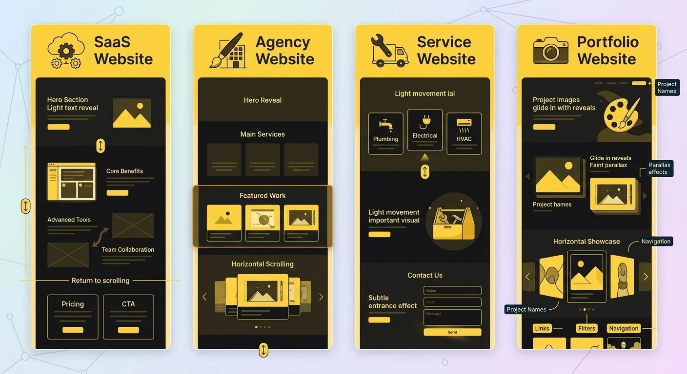
SaaS Website
Keep the hero straightforward.
Add a light text or image reveal, then use a pinned section farther down the page to explain three or four product features.
The screenshot remains visible while the supporting content changes.
After the walkthrough, return to normal scrolling before pricing and the final CTA.
This keeps the product explanation interactive without making the whole page feel overbuilt.
Agency Website
An agency website does not need animation on every service description.
Use a subtle hero reveal, keep the main service content readable, then give more attention to featured work.
Project images can reveal as visitors scroll, while one showcase section could use horizontal scrolling for a stronger visual moment.
Service Website
A service business can keep things much simpler.
For example:
- Reveal the service cards
- Add light movement to one important visual
- Give the contact section a subtle entrance
That can add enough movement without distracting visitors from the service information.
Portfolio Website
Portfolio websites can use animation more heavily because the visual work is part of the experience.
Image reveals, parallax, and horizontal showcases can make projects more interesting to explore.
Still, keep project names, links, filters, and navigation clear.
Keep Scroll Animations Useful, Not Distracting
Most scroll animation problems come from using too much motion.
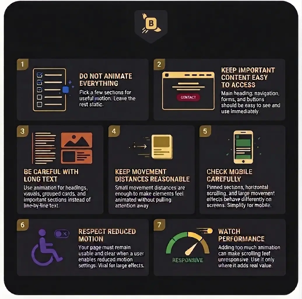
A few simple rules can prevent that.
Do Not Animate Everything
If every heading, paragraph, image, icon, button, and card moves, nothing feels important.
Pick a few sections where motion adds something useful.
Leave the rest static.
Keep Important Content Easy to Access
Do not make visitors wait for basic information.
Your main heading, navigation, service information, forms, and important buttons should remain easy to see and use.
Animation should not become a barrier between the visitor and the content.
Be Careful With Long Text
Animating normal body text line by line or paragraph by paragraph often makes reading slower.
Use animation for headings, visuals, grouped cards, and important sections instead.
Keep Movement Distances Reasonable
Large movement can feel dramatic, but it can also make the page feel unstable.
Small movement distances are often enough to make an element feel animated without pulling too much attention away from the content.
Check Mobile Carefully
Pinned sections, horizontal scrolling, and large movement effects can behave very differently on a smaller screen.
Test each animation on mobile.
If an effect feels awkward, simplify it or remove it for smaller devices.
Respect Reduced Motion
Some visitors use reduced motion settings on their devices.
Your page should still make sense and remain usable when unnecessary motion is reduced.
This is especially important for effects involving large movement, parallax, or continuous scroll-based animation.
Watch Performance
Adding more animation does not automatically create a better experience.
Too many effects running at the same time can make scrolling feel less responsive.
Use animation where it matters and remove effects that add little value.
Common Scroll Animation Mistakes in Bricks
A few mistakes can make an otherwise good animation feel frustrating.
Using Too Many Effects
Combining parallax, pinned content, text animation, image reveals, and horizontal scrolling on the same page can quickly become overwhelming.
Choose a few strong moments instead.
Making Animations Too Slow
Animations should not make visitors wait.
If a reveal takes too long, users may scroll past before the content becomes readable.
Keep durations short enough to maintain the natural flow of the page.
Overusing Pinned Sections
Pinned sections can be useful for product explanations and storytelling, but using several of them on the same page can make scrolling feel heavy.
Use them only where the content benefits from staying in view.
Creating Unnatural Horizontal Scrolling
Horizontal scrolling works best for content that naturally belongs in a sequence, such as projects, timelines, or visual showcases.
Do not force normal page content into a horizontal layout just for the effect.
Ignoring Mobile Behavior
An animation that looks good on a desktop monitor may feel cramped or confusing on a phone.
Always test smaller screen sizes.
Animating Body Copy
Long paragraphs are usually easier to read when they remain still.
Save more visible animation for headings, images, cards, and key visual sections.
Using Motion Without a Purpose
Every animation should support the page.
If the only reason for adding an effect is that it looks impressive, it may not improve the visitor experience.
How BricksFly Helps With Advanced Scroll Animations
Bricks websites can use simple animations for basic entrance effects, but some layouts need more control.
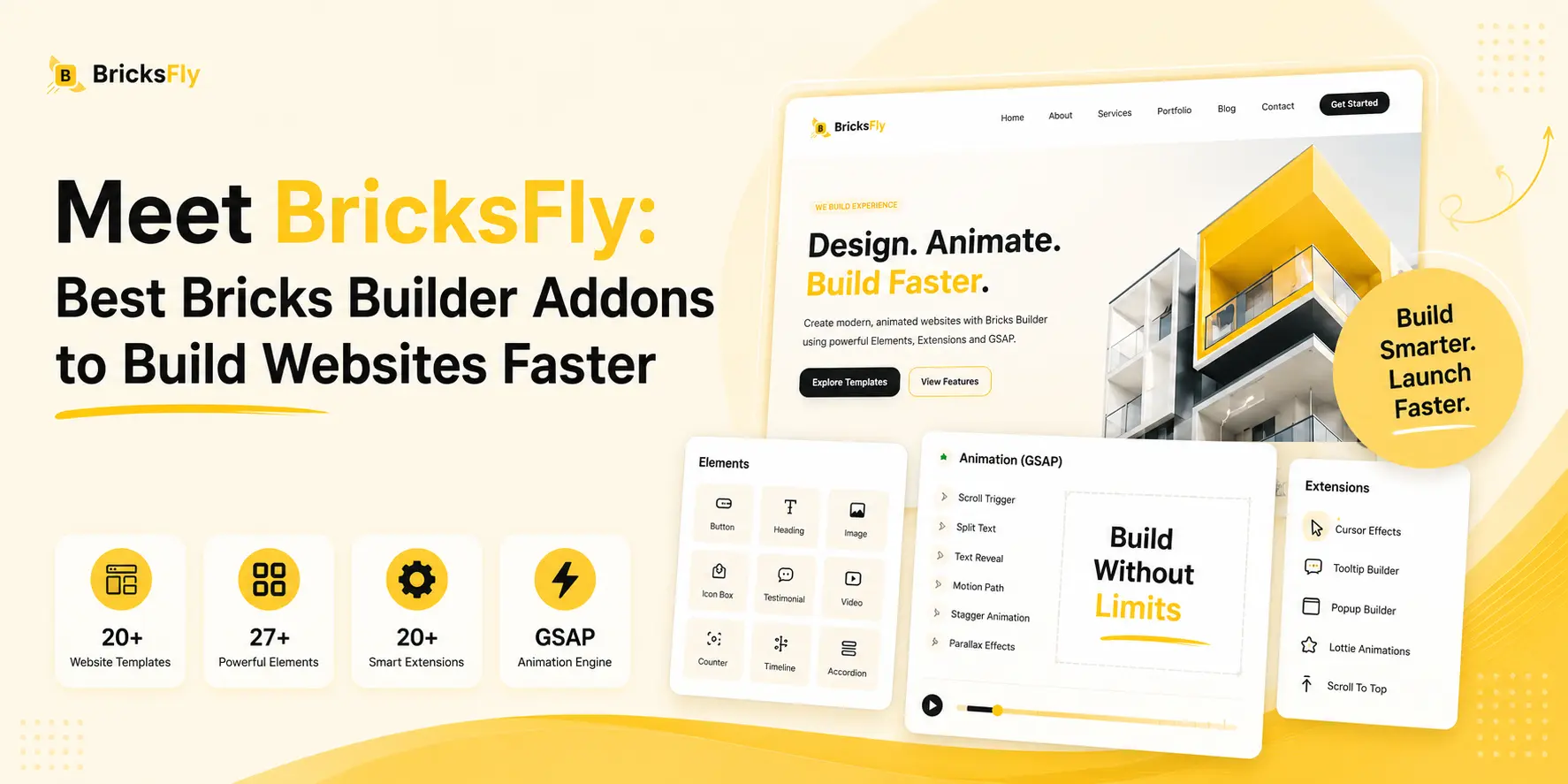
BricksFly provides visual GSAP animation tools directly inside the Bricks workflow.
Current animation options include:
- ScrollTrigger
- Split Text
- Sticky and Pin
- Horizontal Scroll
- Parallax
- Image Animation
- Image Reveal
- Smooth Scrolling
- Cursor Effects
These options are useful when animation becomes part of how the section works rather than just a simple entrance effect.
For example, you could create a SaaS product section where a screenshot remains pinned while different feature descriptions appear during scrolling.
For a portfolio, you could build a horizontal project showcase.
A case study could combine image reveals with a pinned storytelling section.
A landing page could use Split Text on an important heading while keeping the rest of the section simple.
The main advantage is having these controls available visually while working in Bricks, instead of creating every GSAP interaction manually with JavaScript.
You still do not need an advanced effect everywhere.
Use it where the design actually benefits from it.
Final Thoughts
Scroll animations can improve a Bricks website when they make important content easier to notice and help visitors move through the page.
Use simple reveals for headings, feature sections, and CTAs.
Consider pinned content for product explanations, image effects for portfolios, and stronger scroll interactions only where they support the story.
The best result usually comes from using less animation, not more.
Make the content clear first. Then add motion where it genuinely improves the experience.
FAQs
They can. Scroll animations can guide attention, create clearer visual order, and make product or portfolio sections more interesting to explore. Their effectiveness depends on how they are used.
Good places include hero sections, feature blocks, product walkthroughs, portfolios, case studies, process sections, and important CTA areas.
Yes. Too much movement can distract visitors, make content harder to scan, and affect scrolling performance. Focus on a few important moments.
There is no single best effect. Simple reveals work well for headings and cards, while pinned sections, parallax, and horizontal scrolling are better suited to more visual or interactive sections.
Yes, but effects often need to be simplified. Large movement, pinned sections, and horizontal scrolling should be tested carefully on smaller screens.
They can be very effective for SaaS websites because they let you keep a product screenshot visible while explaining multiple features or steps.
No. Horizontal scrolling works best for content such as portfolios, timelines, project showcases, or visual sequences. Normal content should usually continue using standard vertical scrolling.
BricksFly includes GSAP-based options such as ScrollTrigger, Sticky/Pin, horizontal scrolling, parallax, Split Text, image animation, image reveal, smooth scrolling, and other interactive effects.
BricksFly is designed to provide visual controls for advanced animation workflows inside Bricks, so you do not need to manually build every GSAP interaction with JavaScript.


One response to “How to Improve Bricks Website Engagement with Scroll Animations”
[…] Scroll reveals pace the story of your work, bringing case-study sections and details in as the visitor reaches them. Subtle parallax on hero or feature images adds depth. Both keep the portfolio feeling alive without distracting from the work itself. […]