
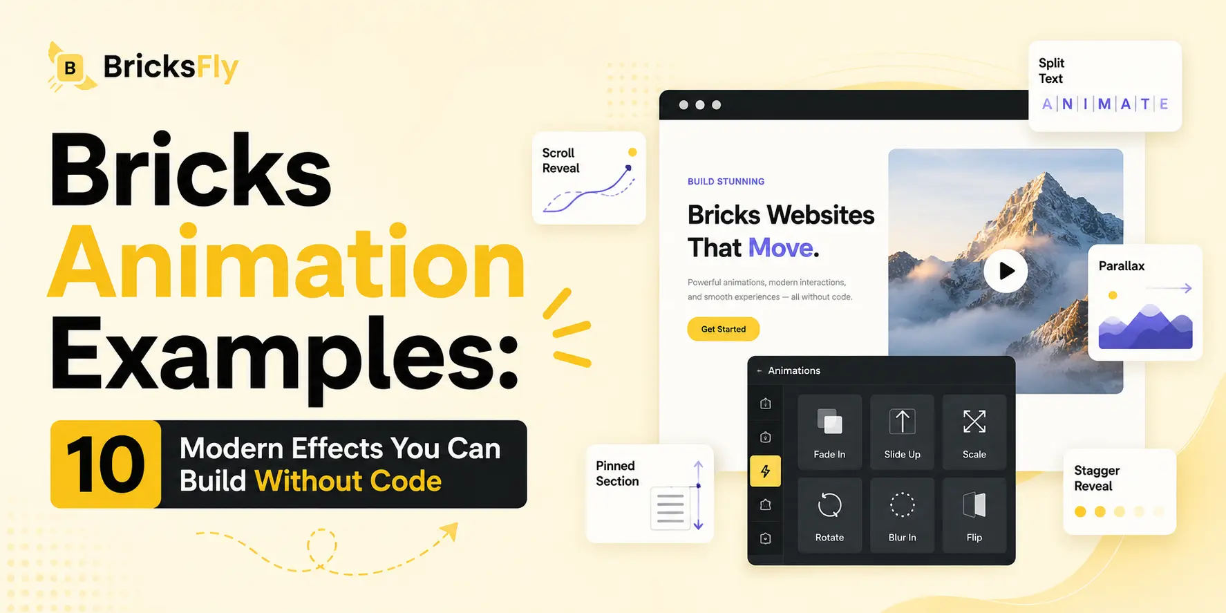
Looking for Bricks animation examples you can actually build yourself? Seeing a list of modern effects, and knowing each one is achievable without code, is the fastest way to imagine what your own Bricks websites could look like. Whether you’re a designer chasing a premium feel, a freelancer wanting to stand out, or an agency raising the quality of client work, the right animation turns a flat page into something that engages.
The barrier used to be technical. Most of these effects rely on GSAP and JavaScript, which put them out of reach for anyone who doesn’t code. That’s changed. No-code animation tools now let you build the same scroll reveals, split-text headings, parallax, and pinned sections through visual controls, so the examples below aren’t just inspiration, they’re all things you can create directly in Bricks.
This article is a practical gallery of 10 modern animation examples for Bricks, what each effect is, where it works best, and why it’s effective, all buildable without code. We’ll cover everything from simple scroll reveals to horizontal scroll and pinned storytelling. By the end you’ll have a shortlist of effects to try on your next project, and you can explore live demos of each using a tool like BricksFly.
Quick Answer: Modern Bricks animation examples you can build without code include scroll reveals, split text headings, parallax, pinned sections, horizontal scroll, staggered grids, animated counters, image reveals, button hover effects, and smooth scrolling. No-code tools like BricksFly let you create all of these through visual controls, no GSAP or JavaScript required.
Why These Animation Examples Work Without Code
Before the examples, here’s why every effect on this list is achievable without touching JavaScript.
Almost all modern web animation is powered by GSAP (the GreenSock Animation Platform) and its plugins, mainly ScrollTrigger for scroll-based effects and SplitText for text animation. Traditionally, using these meant writing code: loading libraries, registering plugins, and defining each animation by hand. That’s what makes premium effects a developer’s job.
No-code animation tools change the how, not the what. The animation is still powered by the same GSAP engine, but instead of writing it, you configure it visually, choosing the effect, the trigger, and the timing in a settings panel. The tool generates the underlying code. So the examples below deliver genuine GSAP-quality results; you just build them by clicking rather than coding.
That’s why this list is practical, not aspirational. Every effect here is something a designer or freelancer can add directly in the Bricks editor. The only requirement is a no-code animation tool that includes these effects, and the willingness to use them with purpose (more on that at the end).
10 Modern Bricks Animation Examples
Here’s the gallery. For each effect, you’ll see what it is, where it shines, and why it works. All are buildable without code, and each has a live demo worth exploring.
| Effect | Best For | Difficulty Without Code |
| Scroll reveal | Sections, cards, content | Easy |
| Split text heading | Hero headlines | Easy |
| Parallax | Backgrounds, images | Easy |
| Pinned section | Product storytelling | Medium |
| Horizontal scroll | Portfolios, galleries | Medium |
| Staggered grid reveal | Feature/service grids | Easy |
| Animated counter | Stats, achievements | Easy |
| Image reveal | Portfolios, visuals | Easy |
| Button hover animation | CTAs, interactions | Easy |
| Smooth scrolling | Whole-site polish | Easy |
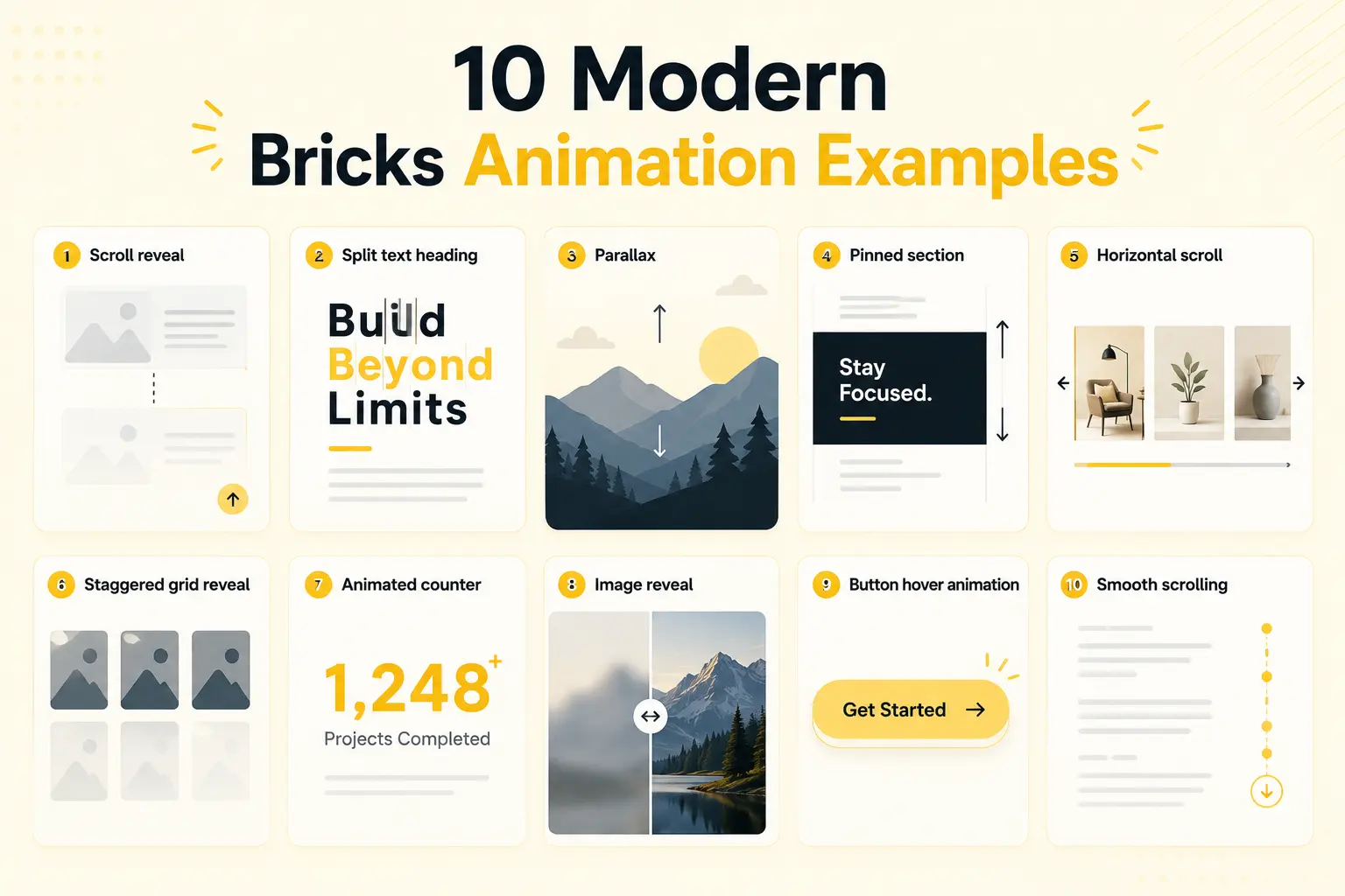
1. Scroll Reveal
The classic scroll reveal is often the first animation people add to a website because it delivers immediate visual impact with very little effort. As visitors move down the page, sections gently fade, slide, or scale into view rather than appearing instantly. This creates a sense of progression and guides the user’s attention naturally from one piece of content to the next.
Scroll reveals work almost everywhere:
- Feature sections
- Service cards
- Testimonials
- Pricing tables
- Team sections
- Blog content
The key to using this effect successfully is restraint. Animations should feel smooth and natural, not dramatic or distracting. A subtle fade-up or slight slide-in is usually enough to make the entire page feel more polished and interactive.
For most websites, mastering scroll reveals alone can significantly improve the user experience and make a static design feel modern and premium.
2. Split Text Heading
Split text animation breaks a headline into individual words, characters, or lines and animates them in sequence. Instead of an entire heading appearing at once, each piece enters with a slight delay, creating a dynamic, cinematic reveal.
This effect is especially effective in:
- Hero sections
- Landing page headlines
- Product announcements
- Portfolio intros
- Creative agency websites
Because split text instantly grabs attention, it works best when reserved for important headings. Animating every heading on a page can quickly become overwhelming and reduce the impact.
A single, beautifully animated hero title immediately communicates that the website has been carefully crafted. It creates a strong first impression and sets the tone for the entire browsing experience.
3. Parallax
Parallax animation creates the illusion of depth by moving background and foreground elements at different speeds during scrolling. As users move through the page, some elements appear to drift more slowly while others move faster, creating a layered, immersive experience.
Parallax works particularly well with:
- Hero sections
- Large background images
- Product showcases
- Feature illustrations
- Storytelling sections
The most effective parallax effects are often the most subtle. A gentle movement of 10% to 20% can add richness and sophistication without distracting the visitor.
Overusing parallax or making elements move too dramatically can make the page feel gimmicky and even create usability issues. The goal is to enhance depth and engagement, not overwhelm the user.
4. Pinned Section
A pinned section, sometimes called scroll storytelling, keeps an element fixed in place while surrounding content continues to scroll. This technique allows you to present information step by step while maintaining focus on a particular image, product, or visual element.
Pinned sections are extremely effective for:
- SaaS product explanations
- Product feature walkthroughs
- Timelines
- Case studies
- Process sections
- Interactive presentations
For example, an image of a product can remain visible while different features appear beside it as the visitor scrolls.
This storytelling approach helps users absorb information in a structured way and prevents important visuals from disappearing too quickly. When used thoughtfully, pinned sections can dramatically increase engagement and make complex information easier to understand.
5. Horizontal Scroll
Horizontal scrolling transforms the traditional vertical scrolling experience by moving content sideways. As visitors scroll down, a gallery, timeline, or collection of items moves horizontally across the screen.
This effect works particularly well for:
- Portfolios
- Project showcases
- Image galleries
- Timelines
- Product collections
- Story-driven experiences
Horizontal scrolling immediately stands out because it breaks users’ expectations and creates a more immersive browsing experience.
However, it should always serve a purpose. If content doesn’t naturally benefit from a sideways presentation, the effect can feel forced.
Special attention should also be given to mobile devices to ensure the experience remains smooth and intuitive across all screen sizes.
6. Staggered Grid Reveal
Instead of revealing an entire grid at once, a staggered animation introduces each item one after another with a slight delay. The result is a smooth, choreographed sequence that feels intentional and highly polished.
This effect is perfect for:
- Feature cards
- Service blocks
- Team members
- Logo sections
- Portfolio grids
- Pricing cards
The small timing difference between each item creates a sense of rhythm and movement without overwhelming the visitor.
Staggered reveals are particularly satisfying because they guide the eye naturally across a section. Rather than presenting a wall of content all at once, they encourage users to explore each item individually.
It’s one of the simplest ways to make a standard grid layout feel significantly more premium.
7. Animated Counter
Animated counters bring statistics to life by counting numbers upward when they enter the viewport. Instead of simply displaying a static number, the motion itself draws attention and emphasizes the importance of the information.
Animated counters are commonly used for:
- Projects completed
- Customer numbers
- Revenue statistics
- Years of experience
- Testimonials
- Performance metrics
Examples include:
- 500+ Projects Delivered
- 98% Customer Satisfaction
- 50,000+ Active Users
Because movement naturally attracts attention, animated counters make achievements feel more significant and memorable.
This is a small effect with a surprisingly large impact, especially in sections designed to build credibility and trust.
8. Image Reveal
Images reveal animations introducing visuals through a fade, scale, mask, or clipping effect as they enter the viewport. Rather than appearing instantly, images feel intentionally presented to the visitor.
Image reveals work particularly well in:
- Portfolios
- Case studies
- Product galleries
- Photography websites
- Agency websites
- Featured content sections
Even a simple fade-in can make images feel more refined and carefully curated.
More advanced reveals, such as masks or directional wipes, can add an editorial or premium feel when used sparingly.
Because images often carry the strongest visual impact on a page, giving them a thoughtful entrance can dramatically improve the overall quality of the design.
9. Button Hover Animation
Button hover animations are small micro-interactions that occur when users place their cursor over a button. These effects might include:
- Slight scaling
- Color transitions
- Arrow movements
- Icon shifts
- Underline animations
- Background fills
Although subtle, these interactions play an important role in user experience.
Hover effects make buttons feel responsive and interactive, reassuring users that an action is available and encouraging clicks.
Well-designed micro-interactions also communicate attention to detail. Visitors may not consciously notice them, but they contribute significantly to the perception of quality and professionalism.
Small animations often have an outsized effect on how polished a website feels.
10. Smooth Scrolling
Smooth scrolling changes the way users move through a website by replacing abrupt jumps with fluid, natural movement. Instead of instantly snapping between positions, the page glides smoothly from one point to another.
Smooth scrolling enhances:
- Long-form landing pages
- Storytelling websites
- Portfolio sites
- Agency websites
- Premium brand experiences
While it may seem like a minor enhancement, smooth scrolling acts as the foundation that ties other animations together.
Scroll reveals, parallax effects, and pinned sections often feel more cohesive and refined when paired with smooth scrolling.
The effect should remain subtle and responsive. Visitors should feel that the website is smooth and polished without becoming aware of the technology behind it.
When implemented correctly, smooth scrolling gives an entire website a premium, carefully crafted feel from top to bottom.
How to Choose the Right Effects for Your Project
Ten examples is a menu, not a checklist, you shouldn’t use all of them on one site. Choosing well is what separates a premium result from a chaotic one.
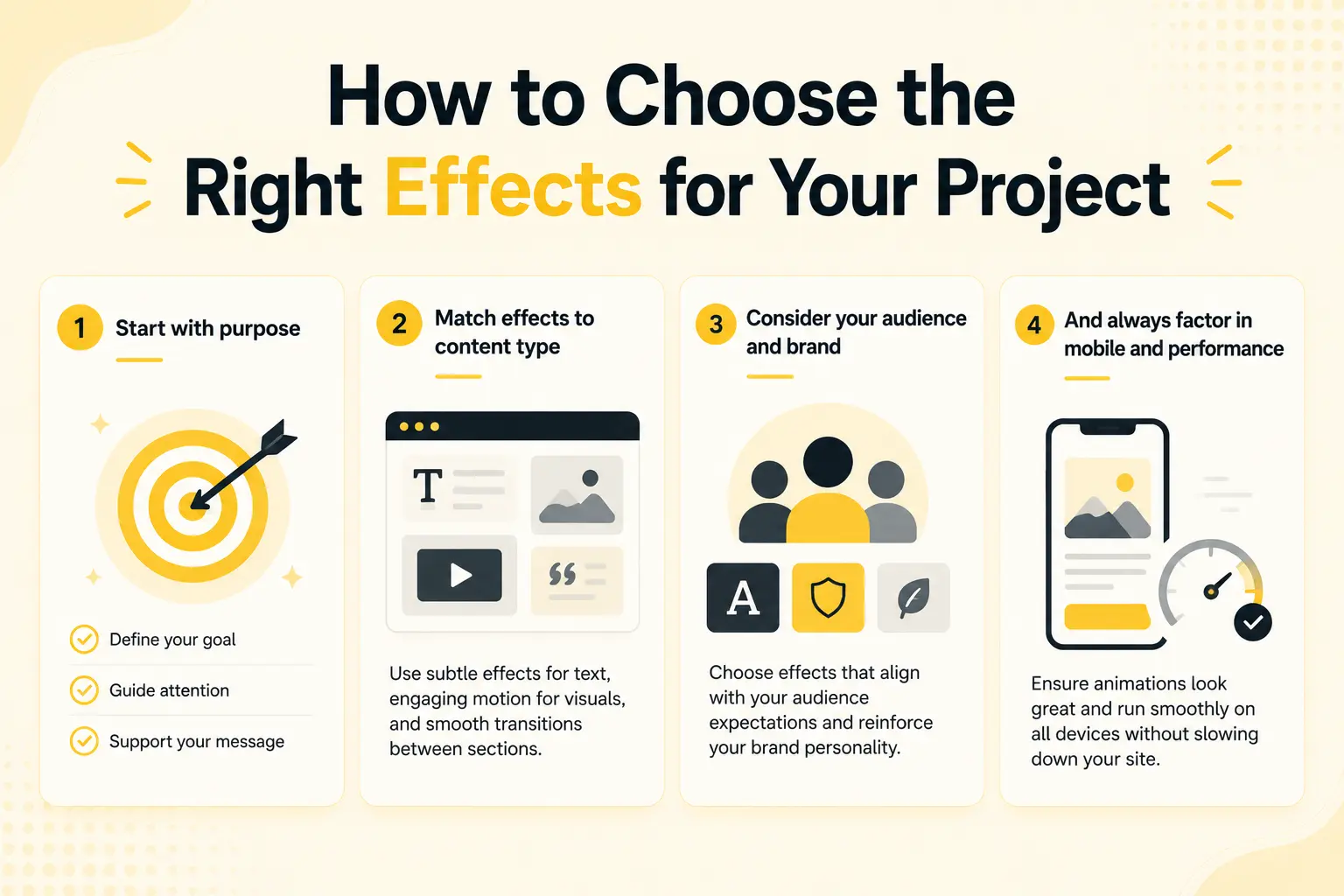
Start with purpose. Each effect should do a job: guide attention, pace a story, emphasize a CTA, or add polish. If you can’t name why an animation is there, it probably shouldn’t be. A scroll reveal on key sections and a split-text hero often do more than ten effects competing for attention.
Match effects to content type. Portfolios suit image reveals and horizontal scroll. SaaS pages suit pinned sections. Stats sections suit animated counters. Feature grids suit staggered reveals. Let the content guide the effect, not the other way around.
Consider your audience and brand. A playful brand can lean into bolder motion; a corporate one usually wants subtle, restrained effects. The animation should reinforce the brand’s personality, not fight it.
And always factor in mobile and performance. Some effects (horizontal scroll, heavy parallax) need care on phones. Test on mobile, keep effects quick, and don’t stack so many that the page slows down. A fast site with a few purposeful effects beats a flashy, sluggish one.
A good rule: pick two or three effects that serve your key goals, apply them consistently, and resist the urge to animate everything.
Examples and Use Cases
Here’s how these effects combine on real projects.
An agency landing page: A split-text hero (2) makes the first impression, key sections use scroll reveals (1), the services grid animates with a staggered reveal (6), and stats count up with animated counters (7). Four purposeful effects, a cohesive premium feel.
A SaaS product page: A pinned section (4) walks visitors through the product step by step, with smooth scrolling (10) tying the experience together and a button hover animation (9) on the main CTA.
A designer’s portfolio: Horizontal scroll (5) showcases projects, image reveals (8) make each piece feel intentional, and subtle parallax (3) adds depth to the hero. The animation itself becomes part of the portfolio’s appeal.
A business homepage: Restrained and professional, just scroll reveals (1) on key sections and a gentle animated counter (7) for results, adding polish without distraction, suited to a corporate audience.
Notice that no project uses all ten, each picks the handful that fit its content and brand.
Common Mistakes to Avoid
When building from these examples, watch for the pitfalls that turn premium into problematic.
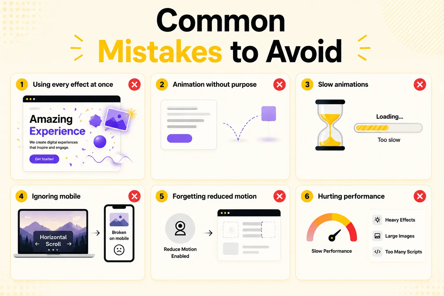
Using Every Effect at Once
Ten effects on one page creates chaos. Pick two or three that serve your goals.
Too many animations compete for attention and make it difficult for visitors to focus on important content. A restrained approach often feels more professional and creates a smoother browsing experience.
Animation Without Purpose
Motion that doesn’t guide attention or add meaning just distracts. Give every effect a reason.
Ask yourself what the animation is trying to achieve before adding it to the page. The best effects support the content instead of stealing attention from it.
Slow Animations
Long durations make a site feel sluggish. Keep effects quick and snappy.
Most interface animations feel best when they are subtle and finish quickly. Fast animations make the website feel responsive and keep users engaged.
Ignoring Mobile
Horizontal scroll and heavy parallax can feel broken on phones. Test and adapt for small screens.
An effect that looks impressive on desktop may become frustrating on touch devices. Always preview animations across different screen sizes and disable effects that hurt usability.
Forgetting Reduced Motion
Respect the reduced-motion setting so users who disable animation still get a usable experience.
Accessibility should be part of your animation strategy from the beginning. Supporting reduced motion ensures your website remains comfortable and inclusive for all visitors.
Hurting Performance
Stacking heavy effects and unoptimized images slows the page. Optimize media and keep the effect count purposeful.
Animations should enhance performance perception, not make the site feel slower. Compress images, avoid unnecessary scripts, and use effects selectively to maintain a fast experience.
How BricksFly Helps
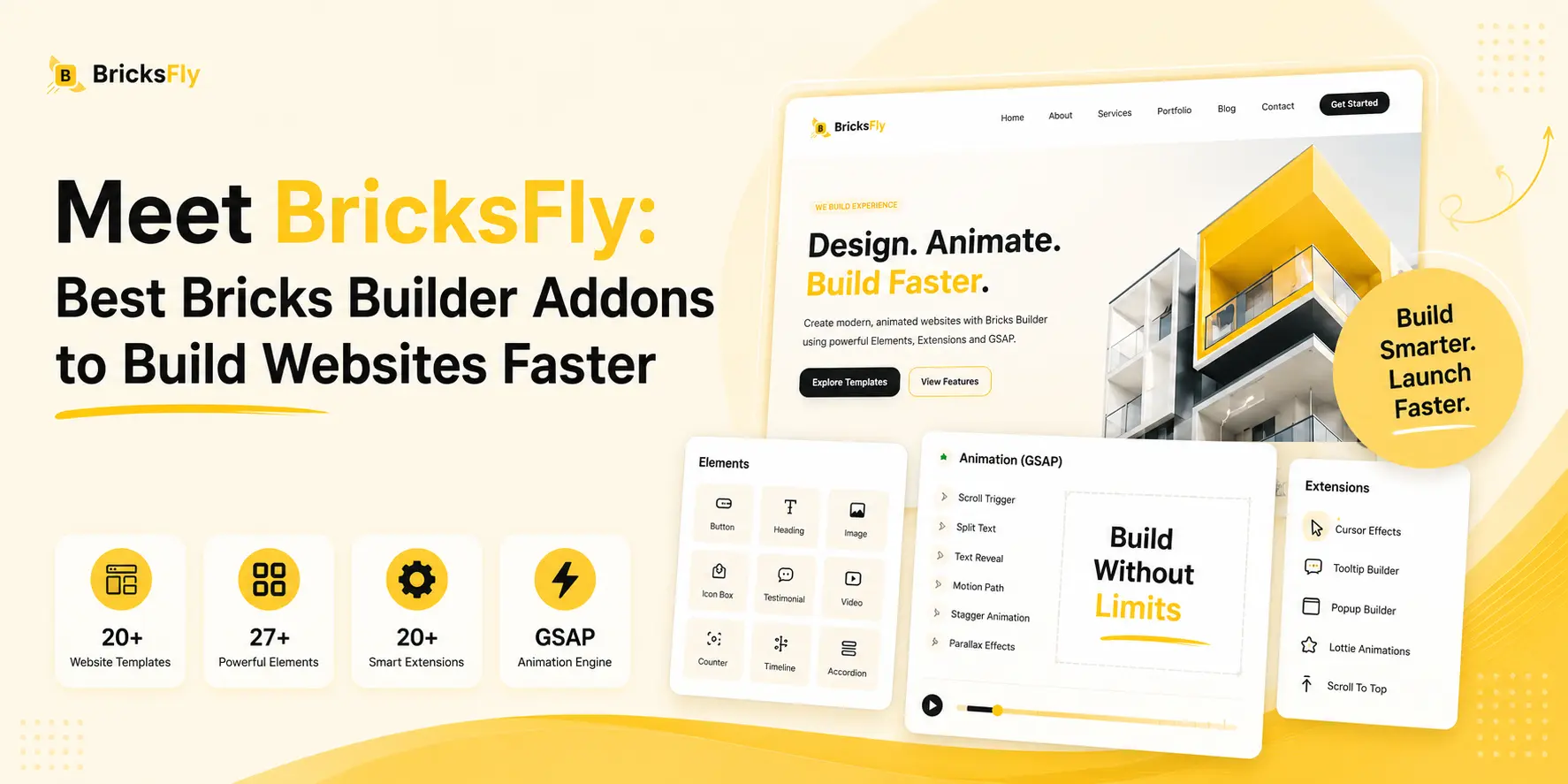
Every animation example in this list is buildable without code using BricksFly. BricksFly is a complete Bricks Builder toolkit whose no-code GSAP animation engine covers all ten effects, scroll reveals, split text, parallax, pinned sections, horizontal scroll, staggered reveals, counters, image reveals, button hover animations, and smooth scrolling, through visual controls in the Bricks editor.
Instead of writing GSAP or SplitText code, you select an element, choose the effect, and tune the timing visually. That means the premium animations you see on agency sites and portfolios become achievable directly, whether you’re a designer, freelancer, or agency team member. And because the effects are configured visually, it’s easy to keep them subtle and purposeful, exactly what these examples call for.
Because BricksFly is a complete toolkit, the animation sits alongside 30+ full website templates and 500+ animation-ready sections. So you can import a polished site, build custom pages from sections, and layer on any of these effects, all in one workflow. The best way to understand what’s possible is to see the effects in motion, which is what the live animation demos are for.
Conclusion
These 10 Bricks animation examples, from scroll reveals and split text to parallax, pinned sections, and horizontal scroll, show what modern animated websites can look like, and every one is buildable without code. The technical barrier that once made these effects a developer’s job is gone; no-code tools power them with the same GSAP engine while you configure everything visually.
The real skill isn’t building the effects, it’s choosing them well. Pick two or three that serve your content and brand, apply them with purpose, keep them subtle and quick, and test on mobile. Done that way, animation makes a site feel premium and engaging rather than busy and slow.
The best way to decide which effects fit your next project is to see them in motion. The next step is to explore live animation demos and try building your favorites directly in Bricks.
FAQs
What animation effects can I build in Bricks without code?
You can build scroll reveals, split text headings, parallax, pinned sections, horizontal scroll, staggered grid reveals, animated counters, image reveals, button hover animations, and smooth scrolling, all without code. No-code tools like BricksFly power these with GSAP behind the scenes, so you configure them visually while getting genuine premium-quality animation.
Are these Bricks animation examples really no-code?
Yes. Each effect is powered by GSAP, the same engine developers use, but a no-code tool lets you configure it through visual controls instead of JavaScript. You choose the effect, trigger, and timing in a settings panel, and the tool generates the code. So the results are genuine GSAP animations, built without writing any.
How many animation effects should I use on one page?
Usually two or three purposeful effects, not all of them. Animation works through contrast, so a few well-chosen effects stand out while too many create chaos and slow the page. Pick effects that serve your key goals (a hero reveal, scroll reveals on sections, an animated CTA) and apply them consistently.
Which Bricks animation effect should I start with?
Start with the scroll reveal, it has the biggest impact for the least effort and suits almost any page. Once that feels natural, add a split-text hero for a premium first impression and a staggered reveal for feature grids. Save pinned sections and horizontal scroll for projects that genuinely call for them.
Do these animations work on mobile?
Most do, but some need care. Scroll reveals, split text, counters, and image reveals translate well to mobile. Horizontal scroll and heavy parallax can feel awkward on phones, so test them and simplify or disable where needed. Always check performance on mobile, since many visitors will experience your site on a phone.
Will these animation examples slow down my website?
They can if overused or paired with unoptimized images. GSAP itself is efficient, so a few well-built effects have minimal impact. Keep effects purposeful and quick, optimize your media, and avoid stacking heavy animations on every section. A fast site with a handful of good effects performs and engages better than a flashy, slow one.